Features

|
Gallery | Free Trial | Purchase | Support |
Now you see it
Magic Maps is an innovative tool for analyzing time-series data on a map. Simply drag in a data file (or download an example map from the Gallery) and start working with your information in a whole new way.

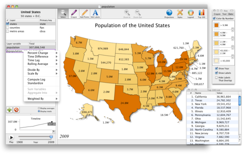
Maps. From the moment you import some data, states and countries immediately light up according to values of interest. And if you like, simply click the map legend to customize the colors and the numeric ranges that they represent. Or, assign colors based on text fields. Within the blink of an eye, Magic Maps gives you the high-level, full-color snapshot that you've been looking for.
Data. Magic Maps lets you enter data manually just by clicking the map, or you can link data from comma-separated variable files, tab-delimited files, or fixed-width text files. For geographic data, you can use the built-in templates, or import your own custom layers from a text file, a KML file, or an ESRI Shapefile. To add custom points to the map without knowing precise coordinates, just use the Pencil tool and start clicking—or let Magic Maps geocode the towns and cities in your CSV files (U.S. only).
Timelines. The world changes, and Magic Maps handles annual data with ease. A timeline in the bottom-left always shows you historical averages and totals. Simply click it, and Magic Maps will show you the map and numbers for any particular year. Or, press the "Play" button, sit back, and watch how your data has evolved over time. No matter what it is that you are trying to understand, gaining a broad perspective couldn't be easier.
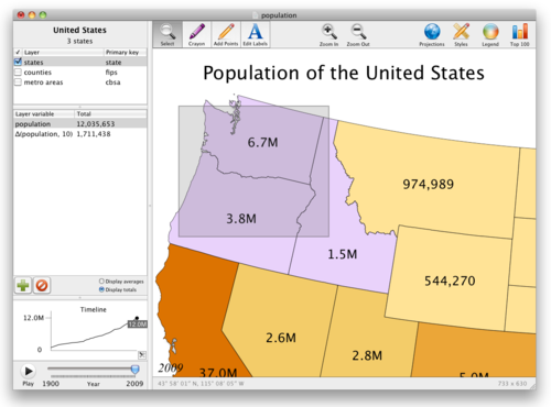
Selections. But suppose you want to analyze a particular region of the map. To view its aggregate numbers, simply draw a selection box that encompasses all the entities of interest (or Command-click to make a more precise selection). The variable table will always show you figures for the current selection. But don't worry about losing that finely crafted subset—it's easy to save a particular selection as a separate layer for later analysis.
Computations. When it's time to drill deeper, Magic Maps provides the tools. You can divide one variable by another, sum variables together, compute rolling averages, or choose from several other mathematical functions with just a few clicks of the mouse. Geographic functions are available, too—Magic Maps makes it easy to count the number of points within 100 miles of Milwaukee (say), or to perform minimum-distance calculations. Then, if you want to analyze the results in your favorite data program, simply export the computed data as CSV.
Analysis. Magic Maps proves that serious analysis can be fun. The Smart Layers feature of Magic Maps let you perform simple or complex queries on your data with a familiar graphical interface—there is no special syntax to learn. The Crayon tool can be used to define regions and compare their averages on the timeline. So don't be fooled by the application icon—Magic Maps is a sharp tool, and a powerful addition to any analyst's toolkit.
Share insights with colleagues
Copy-paste images directly into email. Find something interesting? Copy it to the clipboard, paste it into an email, and fire it off to the team. Anyone can open images created by Magic Maps, and everyone will wonder how you were able to create attractive, insightful maps so quickly.
Export PDFs for presentations. With customizable colors and styles, Magic Maps look terrific in presentations. No matter how big the screen behind you, the vectorized PDF output scales up beautifully. A map can be an effective way to summarize your findings or communicate your vision for the future. Magic Maps will help you make the map that gets remembered.
Save and share Magic Maps files. Send your saved Magic Maps files around the office as easily as a spreadsheet. It's easy to collaborate on maps, share revisions, or drag and drop data from one map into another. So let the data expert inspect the numbers, the design genius tweak the style, and the boss make the final call. Since Magic Maps is easy to use, everyone can contribute.
Communicate with the public
Export PNGs for websites and blogs. In an age of information overload, maps are a great way to grab the attention of your readers—and hold it. Magic Maps can easily export PNG files, which are suitable for inclusion on websites and in blogs. With the data patterns that emerge from your maps, you will never lack for interesting things to talk about, and your readers will never lack for thought-provoking things to discuss.
Export movies for YouTube. Sometimes a still image doesn't tell the whole story, so Magic Maps lets you export your map as a high-definition movie that can be uploaded to YouTube and embedded on your website. Map-movies are a great way to show growth, demonstrate change, and provide historical context in a way that your audience finds compelling. With Magic Maps, you won't need a video-editing expert to turn your map into a movie—just set the playback speed, click the button, and you're done.
Export Dataset Publishing Language. Magic Maps is the only desktop application that can export DSPL, a new file format from Google which lets you upload data to the Google Public Data Explorer. There, your map can be analyzed, explored, and enjoyed by anyone with a web browser. So if you wish to share the interactive nature of your Magic Maps files with the general public, Magic Maps gives you the tools. Even better, because datasets uploaded to Google can be embedded in any web page, your visitors can interact with your data without ever leaving your website.
Magic Maps isn't just for performing analysis. It's easy to create a data-driven map suitable for publication.
Customize the style and appearance
Magic Maps can easily fit into your publication's style or your company's branding.

Customizable appearance. Fonts, colors, line widths, and point sizes are fully customizable with the Styles palette. Choose the look that matches the rest of your publication—and save it as a preference in order to save yourself time later.
Drop shadows. Ever wonder why some maps seem to leap off the page? Sometimes the answer is as simple as a drop shadow. Just check a box and a shadow will fall under the map's shapes—no need to fire up Illustrator. Drop shadows look particularly stunning beneath continents and island chains.
Intelligent leading lines. Map labels don't always fit inside the shape they're supposed to, so a leading line is often necessary. With Magic Maps, simply drag a label outside its shape, and a leading line automatically connects the label back to the source. But if you ever rescale the map so that the label does fit inside the shape, the label automatically pops back inside, like magic. We thought a lot about leading lines—so that you don't have to.
Export vectorized PDF
Magic Maps can be exported as PDF, which preserves the minutest details of geographic features and is ready for print or desktop publishing programs. If additional editing is needed, simply bring the PDF into your favorite vector-editing program and finish the job.
Import any KML or Shapefile
Magic Maps ships with map templates for common needs: countries of the world, U.S. states, U.S. counties, and U.S. metro area. If you need only a few states or counties, simply select the entities you don't want to keep, hit Delete, and poof—they are wiped away.
But if you need more than the built-in templates, there is a world of map templates out there in the form of industry-standard Shapefiles and newer KML files. Once installed, Magic Maps will recognize KML and Shapefiles on your computer; simply double-click one to open it up.
KML files and Shapefiles are often available through the websites of governments and non-profits, including www.geocommons.com. Alternatively, you can manually create your own KML files with the "My Maps" tool on Google Maps, then import it into Magic Maps.
Tune map parameters
So often an afterthought, the proper map projection can help your readers recognize familiar territory more quickly, and put the map in the proper perspective.
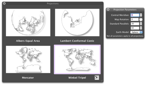
Fortunately, Magic Maps ships with eight professional map projections, including Albers Equal Area, Lambert Conformal Conic, Mercator, and Winkel Tripel. Just click the Projections icon, and you'll instantly see a preview of all four. Simply click your favorite projection to apply it. Each projection can be adjusted via its projection parameters, so that you can tune your all of your maps to your heart's content.
Like all elements of design, a well-chosen map projection lets your readers focus on more important things.
You don't have to be a pro to use and enjoy Magic Maps. Magic Maps has features for creative types, data junkies, and the simply curious.
Draw with ease
The drawing tools in Magic Maps can be used to make casual maps destined for a bulletin board, the refrigerator, or the back of a T-shirt.

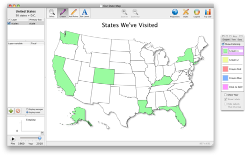
Crayon tool. Color the world however you want with the Crayon tool; just click and start filling in any map with up to 5 colors of your choice. Save your favorite colors to your preferences for later use, and select a background color to match. With Magic Maps, the world is your canvas.
Pencil tool. With the Pencil tool, adding points of interest to the map is as easy as clicking where you want each point to go. For more precise additions, use the Zoom feature, or let the status bar tell you the exact latitude and longitude of where you are about to click.
Text tool. Label each point and shape using the Text tool; just click, type, and press Enter. Click and drag to adjust each label's location; a leading line will always connect the label back to its source. Then, style your labels with your favorite font and color.
Delete button. Are some states getting in the way of good design? Just select the ones you don't want to see, press Delete, and they're gone.
Undo button. Make a mistake? Not to worry. Just press Undo and pretend it never happened.
Interact with data
If you like seeing data, you'll love using Magic Maps. See the Gallery page for some of our favorite data-packed maps.

Colors and timelines. Take in the big picture, then click any location to see its information. Hover to see any location's timeline, and compare it to the average. Because the status bar tells you where you're hovering, you'll always know exactly what you're looking at.
Selection box. As you draw a selection box, and the data tables and timeline instantly update to show you the corresponding numbers. You'll have fun just whizzing around the country with your mouse.
Top 100 list. Want to know where your state or county ranks? Just click the Top 100 icon, and see the current standings for any variable of interest. Press the Play button, and watch as the list changes over time.
Links to Wikipedia. Curious about a particular county? Select it, and a link appears that will take you straight to its Wikipedia page.
Play with projections
If you're interested in map projections, or just like seeing the world in a new perspective, you'll enjoy the map projection features of Magic Maps.

Mercator and more. The Mercator projection is popular, but it makes some countries appear to be much larger than they actually are. Try out the Albers Equal Area projection to see a map where countries of equal area are drawn with equal size.
Map rotations. Use the Rotation knob to turn the country upside-down, or turn the world on its side. Print out a map with upside-down labels and challenge your students to think in a new way.
Ellipsoidal and spherical. Ever wonder how much of a difference it makes to approximate the earth as a sphere? Use the drop-down box to find out.
Central meridians and standard parallels. The adjustable map parameters mean that there is an unlimited number of possible map projections. Play around with them and see the choices that professional cartographers have to make every day.
Magic Maps was designed from the ground up as a Mac application. As such, it benefits from enhanced ease-of-use and increased performance.
Desktop integration
Magic Maps seamlessly integrates with your desktop environment so that you can work more productively.
Drag and Drop. To import data, simply drag a file from the Finder into the variable table. To export data as CSV, drag one or more variables from Magic Maps over to the Finder, and presto! A new CSV file appears.
Copy-Paste. Working with a spreadsheet? Just copy the cells that contain your data (along with a header row), paste directly into Magic Maps, and instantly behold a map that is colored according to your data.
Spotlight search. Because Magic Maps was built with Core Data, Spotlight will automatically search through the labels, titles, and variable names in Magic Maps files. So even if your desktop is a mess, Magic Maps files are always easy to reach.
Under the hood
Accelerated computation. To give you the best performance even with large data sets, we enlisted the help of Apple's amazing Accelerate framework. As a result, many of the built-in mathematical functions are up to 4 times faster than before.
Live projections with Metal. The Projection Preview window seems like a no-brainer, but you won't find it in any other maps program. Why? Because projecting the earth's surface onto a map is computationally intensive, and the process normally requires you to sit and wait for the computation to finish. For Magic Maps, we took the time to rewrite all of our map projection routines in Metal. As a result, you can tweak map parameters and see the result almost instantly.
GPU distance calculations. We also rewrote our distance routines in Metal, and used a few extra tricks to give you the absolute best performance when it comes to geographic calculations. So for most uses, drawing a blast radius or calculating a minimum distance occurs in the blink of an eye. And because Magic Maps performs the computations in parallel, it can take full advantage of modern multi-core processors.
Technical Specifications
|
System Requirements ✓ Mac OS X 10.14 (Mojave) installed ✓ 64-bit Intel processor ✓ 2GB (4 GB recommended) Core features ✓ Layer-based map presentation ✓ Multiple data fields per layer ✓ View a timeline of data totals and averages ✓ Click an entity to see its associated data ✓ Select multiple entities with a selection box or the Command key ✓ "Top 100" rankings for any data field ✓ Click "Play" to watch any map evolve over time Data import ✓ Import data from CSV, KML, or Shapefiles ✓ Copy-paste data directly from a spreadsheet ✓ Manually edit data by clicking the map ✓ Support for UTF-8, Unicode, Latin-1, and Windows-1252 text encodings Map export ✓ For print or presentations: Export vectorized PDF ✓ For the web: Export PNG ✓ For email: Command-C copies the current image to the clipboard ✓ For spreadsheets: Export CSV data ✓ For YouTube: Export high-def QuickTime movies ✓ For Google Earth: Export KML ✓ For Google Public Data Explorer: Export Dataset Publishing Language (DSPL) Add custom points ✓ Point-and-click to add a single point ✓ Batch CSV import of latitude and longitude ✓ Batch geocoding of U.S. place names (town or city) Add custom layers ✓ Import KML or KMZ (including network links) ✓ Import ESRI Shapefiles ✓ Link data to custom layers ✓ Search for public templates at www.geocommons.com Customizable appearance ✓ Use the crayon tool to color a simple map ✓ Choose colors to represent text categories or numeric ranges ✓ Move labels by clicking and dragging ✓ Leading lines automatically connect labels to their source ✓ Customize any fonts, colors, and sizes ✓ Optional drop shadows on shapes ✓ Adjustable movie playback speed Built-in math functions ✓ Year-over-year change in absolute or percentage terms ✓ Sum multiple variables together ✓ Divide one variable by another ✓ Compute natural logarithm ✓ Scale by powers of 10 ✓ Compute rolling average ✓ Compute weighted average Map projections ✓ Albers Equal Area ✓ Equal Earth ✓ Equidistant Cylindrical and Plate Carrée ✓ Gall Stereographic ✓ Lambert Conformal Conic ✓ Mercator ✓ Winkel Tripel ✓ Instantly preview map projections ✓ Customize central meridian and standard parallels ✓ Support for spherical and ellipsoidal earth projections GIS functionality ✓ Count points within an area ✓ Aggregate point data within an area ✓ Draw a "blast radius" of a specified distance around points ✓ Compute distance to nearest point on another layer ✓ Perform simple queries using Smart Layers Built-in geographic templates ✓ Countries of the world ✓ U.S. states ✓ U.S. counties ✓ U.S. metro areas ✓ Link data against FIPS codes or state/country name |
User Manual
A full-color user manual written by the developer can be downloaded as a PDF file:
↑ Back to top